Stripes:
When mixing two patterns of the same design, we should always make sure that they are each as different in size as possible. If both are similar in size, the pattern will create an optical illusion, or an effect, of movement.
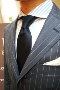
In picture one, we can see how the two stripes are visually compatible due to their spacing. Meanwhile, the solid tie creates an overall comfort as the eye takes in the composition.
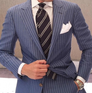
Picture two shows a wide pinstripe suit paired with an even wider double striped tie. The harmony is achieved by the difference in space and the common factor of white, which is present in the white of the shirt, pocket square and the stripes of the suit and tie.
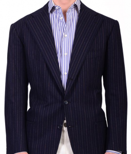
Picture three is a clear example of what not to do. The proximity in width of both patterns creates a busy effect that forces the eye to work overtime in order to simply focus.
Cuadros:
Visualmente combinar cuadros es mas complicado que combinar rayas. Pero tu objetivo principal tal y como con las rayas tiene que ser el contraste. Cuanto mayor sea la diferencia en tamaño de los cuadros mas fácil será de combinar.

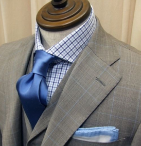
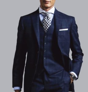
In picture one, the solid tie makes this combination look simple and effortless. The difference in sizes makes the outfit lighter, even though it is filled with pattern and design.
Picture two shows us that, it is not only the size of the pattern that matters, but also how colors make your eye transition from one element of the outfit to another, effortlessly, while still framing everything as a whole.
Picture three is a classic combination of window pain suit with a checkered tie, an easy go-to outfit when starting to match checks.